Posts

Showing posts from May, 2018

magazine cover learner response

Image
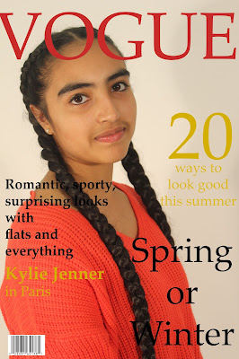
Magazine front cover - Learner response Create a new blogpost called 'Magazine cover learner response' and complete the following tasks: 1) Add your finished magazine cover as a JPEG image. 2) Type up your feedback from your teacher. If you've received this by email, you can copy and paste it across - WWW and EBIs. WWW: good cover photo. EBI: Used serif font which doesn't go with the theme. 3) Consider your mark against the mark scheme above. What are the strengths of your production based on the the mark scheme? Think about magazine cover conventions and the media language techniques you have used to communicate with your audience (e.g. mise-en-scene, camera shot etc.) - I wrote accurate cover lines such as "20 ways to look good" and "Kylie Jenner in Paris" which shows that I know the topic most Vogue magazines talk about. - I put the bar code which is basic knowledge. - The font I used for the title is the sam

mens health representation

Representation and Men's Health: blog task Create a blogpost called 'Men's Health - Representation'. Read  these extracts from the journal article exploring the representation of masculinity in Men's Health magazine  and answer the following questions: 1) Why is Men's Health defined as a 'lifestyle magazine'? It is a popular magazine concerned with lifestyle (fitness). They make sure to show its readers from the first pages that  the publication is not just limited to healthy questions, but it includes more topics concerning men. 2) Why is advertising significant in helping to shape masculine identity? The acquisition of certain  products such as cologne, jeans or cars, helps them to improve and stress their anatomy as the  embodiment of their commitment to health and fitness– by adding status, sophistication and style. 3) The article suggests that the representation of masculinity in Men's Health is not fixed or natural and is subject t

Men's Health CSP analysis

Men's Health analysis: blog task Create a blogpost called 'Men's Health CSP analysis' and complete the following tasks. 1) Write a one-paragraph summary of your notes for each key concept from the booklet: The   cover lines   are in   capitals   and the   font is bold which emphasises that manliness and the heavy, aggressiveness of a a male. T hey have used  stereotypical "male colours" (blue, grey and black) . Reinforces   traditional gender roles .  The masthead   to covered, depicting how the magazine is   well-established . The   model is Vin Diesel who is a very successful actor and this could make readers link how well you do in life to your appearance  .  Intertextuality in "gut gone in 60 seconds". They use direct mode of address which lets there be more of a connection between the audience and the magazine. There is use of alliteration and plosives (BLAST BODY FAT) which makes it catchy for the reader .  The typical readers stat

Magazines: Men's Health - Audience

Men's Health - Audience blog tasks Read the  Men's Health Media Pack  in full to get a good idea of the demographics and psychographics for the Men's Health target audience then answer the following questions: 1) How does the magazine introduce itself? - It uses a picture of a healthy muscly man who is successful which makes it appealing to readers. 2) What does the introduction suggest about the representation of masculinity in Men's Health's? - It suggests that masculinity means being fit, strong, muscly, groomed but still wearing the last watches and styles. 3) How do the print statistics for Men's Health compare to GQ and Esquire? - Men's health's print statistics are higher to a large extent. For example 995 compared to 336 and 109. 4) What is the difference between circulation and readership? 995 compared to 336 and 109 and 643 compared to 237 and 85. 5) What is the circulation of Men's Health in thousands? What about the rea

Magazine practical task evaluation

Image
2) Write an  evaluation  of your work: have you succeeded in your brief to create a new, original edition of an existing magazine? - I used the same colours used on a real vogue magazine and added features such as the barcode and talk about celebrities with a woman as the main focus. 3) Put your cover alongside a couple of genuine covers of your chosen magazine. How  professional  is your work alongside genuine examples? In my opinion the font could have been abit more similiar to the vogue magazine and the pose could have been different however other then that I think it does look quite proffessional. 4) What is the  strongest  aspect of your work? I think my strongest aspect is keeping the colour scheme. 5) What is the weakest aspect of your Photoshop magazine cover?  I could not find a font that was more similiar and using the actual program was difficult because it was my first time. 6) What would you do differently if you completed this assignment again?