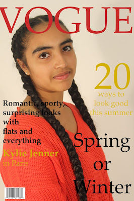
magazine cover learner response
Magazine front cover - Learner response
Create a new blogpost called 'Magazine cover learner response' and complete the following tasks:
1) Add your finished magazine cover as a JPEG image.

2) Type up your feedback from your teacher. If you've received this by email, you can copy and paste it across - WWW and EBIs.
WWW: good cover photo.
EBI: Used serif font which doesn't go with the theme.
3) Consider your mark against the mark scheme above. What are the strengths of your production based on the the mark scheme? Think about magazine cover conventions and the media language techniques you have used to communicate with your audience (e.g. mise-en-scene, camera shot etc.)
- I wrote accurate cover lines such as "20 ways to look good" and "Kylie Jenner in Paris" which shows that I know the topic most Vogue magazines talk about.
- I put the bar code which is basic knowledge.
- The font I used for the title is the same as a real Vogue magazine.
4) Look at the mark scheme again. What can you do to move your mark higher and, if required, move up a level?
- Added more detail and more cover lines but not too much, made the font sans serif instead of serif so it could look more appealing to younger people.
5) What would be one piece of advice you would give a student about to start the same magazine cover project you have just completed?
- Make sure the plan every single detail and scrutinise an original magazine cover so they know the exact font, the basic colour scheme, the cover lines, what the cover photo usually looks like and the little details it may have e.g the date it was published or bar codes.


Comments
Post a Comment